
 You’ve secured a venue, entertainment and a schedule for your event. Now it’s time to start promoting. With a beautifully designed poster, you can build organic buzz around your event and watch it spread like wildfire.
Follow these 5 tips to create a powerful, effective event poster.
Event Poster Design Basics
1. Select tools and a style that suits the feeling of your event.
Use what you’ve got. Hand-drawn, painted, or cut-and-pasted collage posters are still relevant and can be quite successful, but if you feel comfortable in a graphics or word-processing software, go for it. Whatever your skill set, decide what style and effect you’re going for and back it up with your medium or application. Feeling lost? Do a Pinterest search for the particular type of poster you need to make and soak in the inspiration.
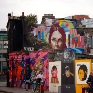
2. Choose engaging imagery and give it a great home.
Less is more, but there is a big difference between simple and plain. Choose central imagery that is clear but has enough detail to be interesting. A beautifully composed photograph of a performer can be effective, but so can a seemingly unrelated illustration. Many well-done show posters use visual metaphors to illustrate something about the experience of the performance in a somewhat off-handed manner. If you are borrowing imagery, make sure that you use high-quality images that are not pixelated, stretched, or distorted. Also make sure they are licensed for commercial use. Whatever approach you take, create a clear focal point with the imagery through placement. Try placing the image off center, using the rule of thirds. Also, when grouping multiple graphic objects present them in odd numbers so that they feel organic (I.e, 1, 3, 5, etc.).
3. Use fonts that connect to the imagery and keep it clean.
Fonts can make or break a great poster. Be unique but not over the top. You don’t have to use all of the fancy free fonts you’ve been collecting. Look to continue the shapes, patterns and textures of your imagery through the design of the letters you use. To be on the safe side, limit the use of various fonts to two or three, and don’t use them at more than four different sizes. Use more stylized fonts for titles and headings, at a larger size for easy readability from a distance. For body text, use a simple clean font that is easy to read at a small size. Pay careful attention to alignment and be consistent. Don’t casually jump back and forth between center, left and right alignment. Limit the use of all caps to headings, and be consistent with capitalization. The difference between the design of a professional and an amateur is often most evident through the treatment of text.
4. Be intentional when selecting colors.
Not sure what colors to use? Take hints from the colors of the imagery you’ve selected! If you’re using a photograph, use tones from the actual photo (you can utilize the eyedropper tool if you’re using graphics software). Choose contrasting colors. Neutrals are easy on the eyes for small type. High-impact colors like red, orange or yellow, can draw attention to sparingly-selected important details. Remember to continue to connect with the characteristics of your other elements with the selection of color – how does it make you feel? Does it make flow with the textures, forms, and lines of your imagery and fonts? This level of intention will help result in a cohesive end-product.
5. Balance your components.
You’ve picked strong imagery, exciting but readable fonts, and a beautiful color palette. Play with the elements until you’ve achieved good flow and balance. The eye should move easily from the engaging imagery to easy-to-read text. When arranged properly all elements should come together to create a single unified visual experience. Step back and take a look at the design at its actual size. If you are perceiving disconnected objects, rearrange them until the composition feels harmonious and cohesive.
Now that you have an awesome poster, create an event.
 Arts
Arts Comedy
 Event Tips
 Film
Film Food & Drink
 Good Causes
 Music
Music News
News Radio
Radio Roller Derby